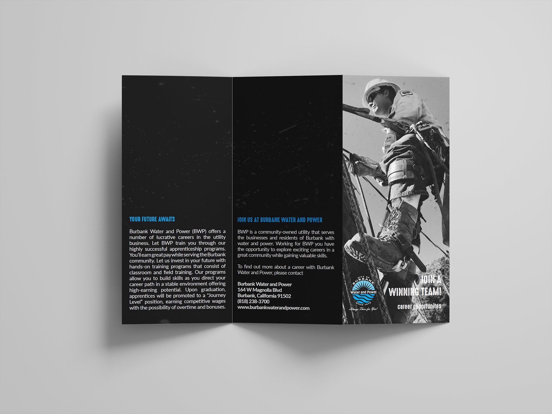
final brochure recto
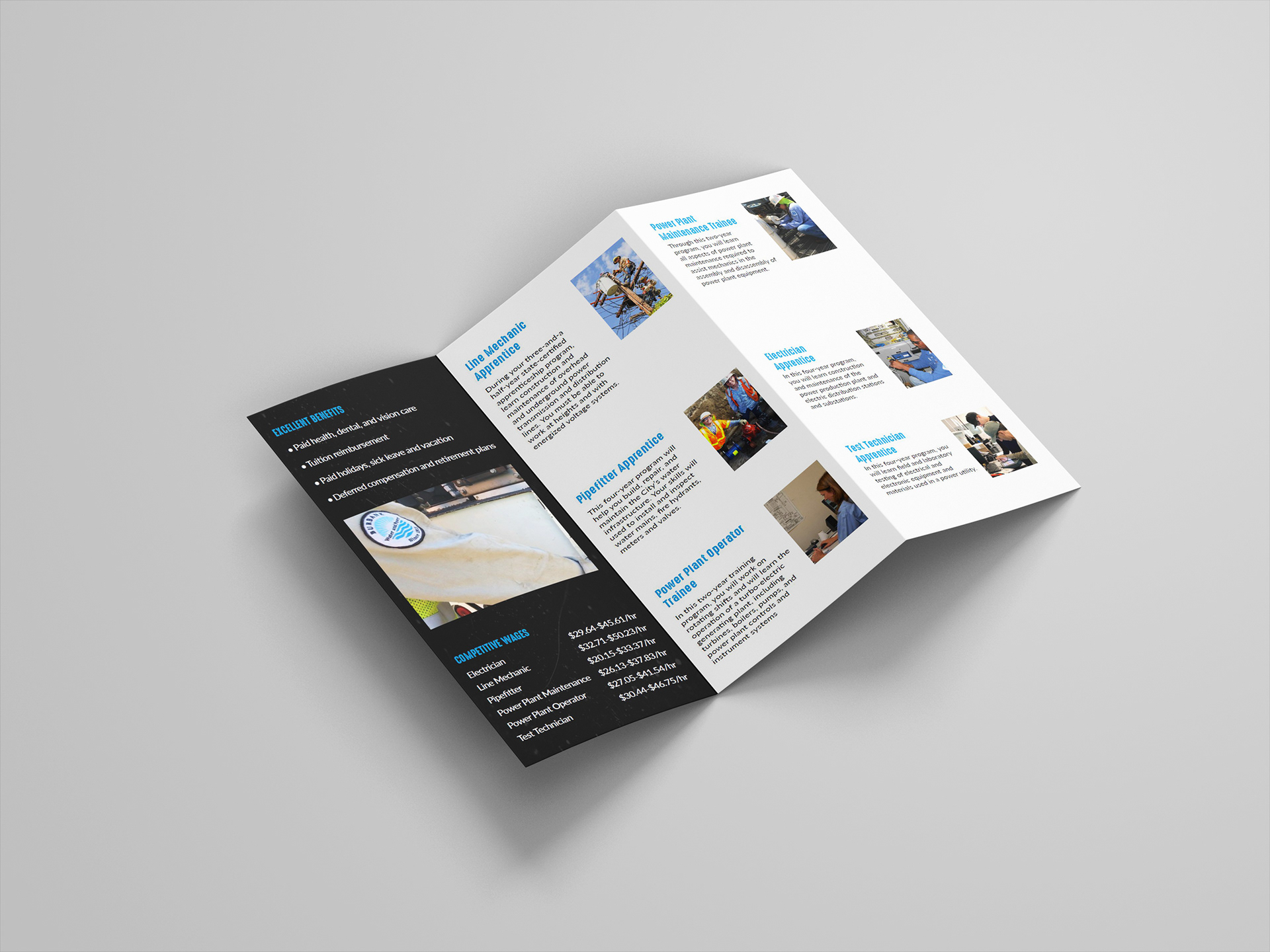
final brochure verso
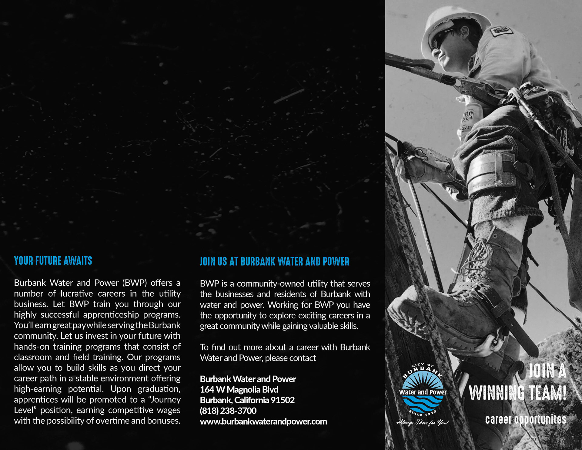
final brochure flat recto
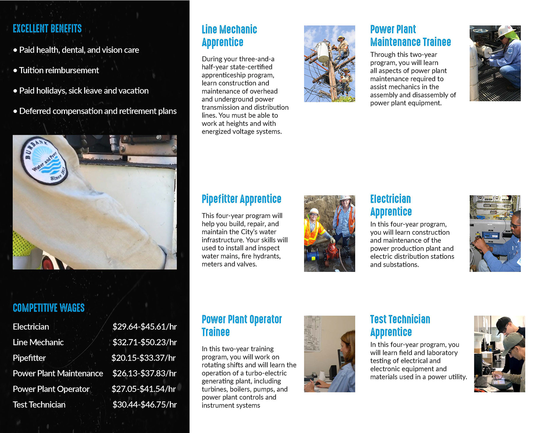
final brochure flat verso
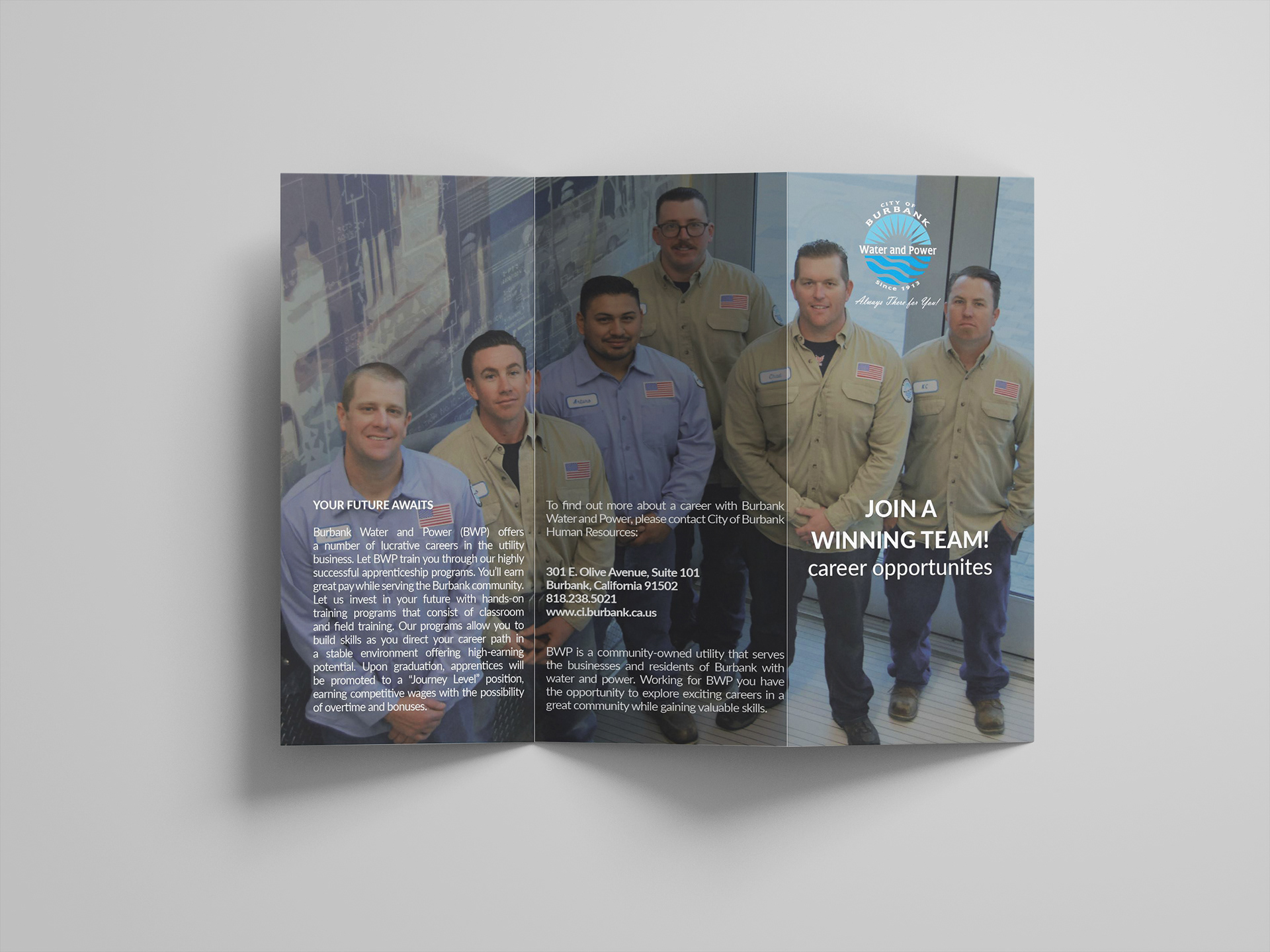
first draft brochure recto
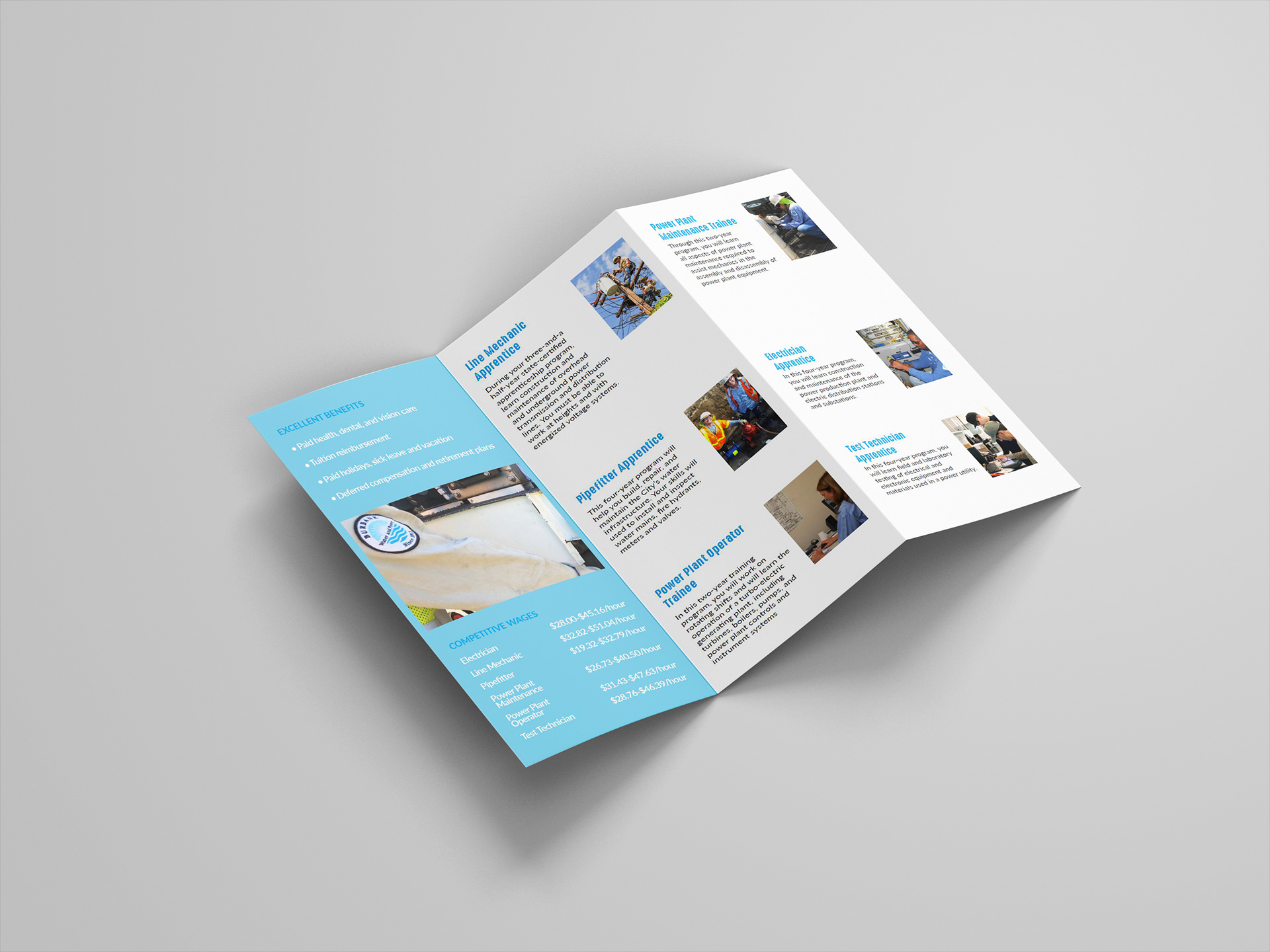
first draft brochure verso
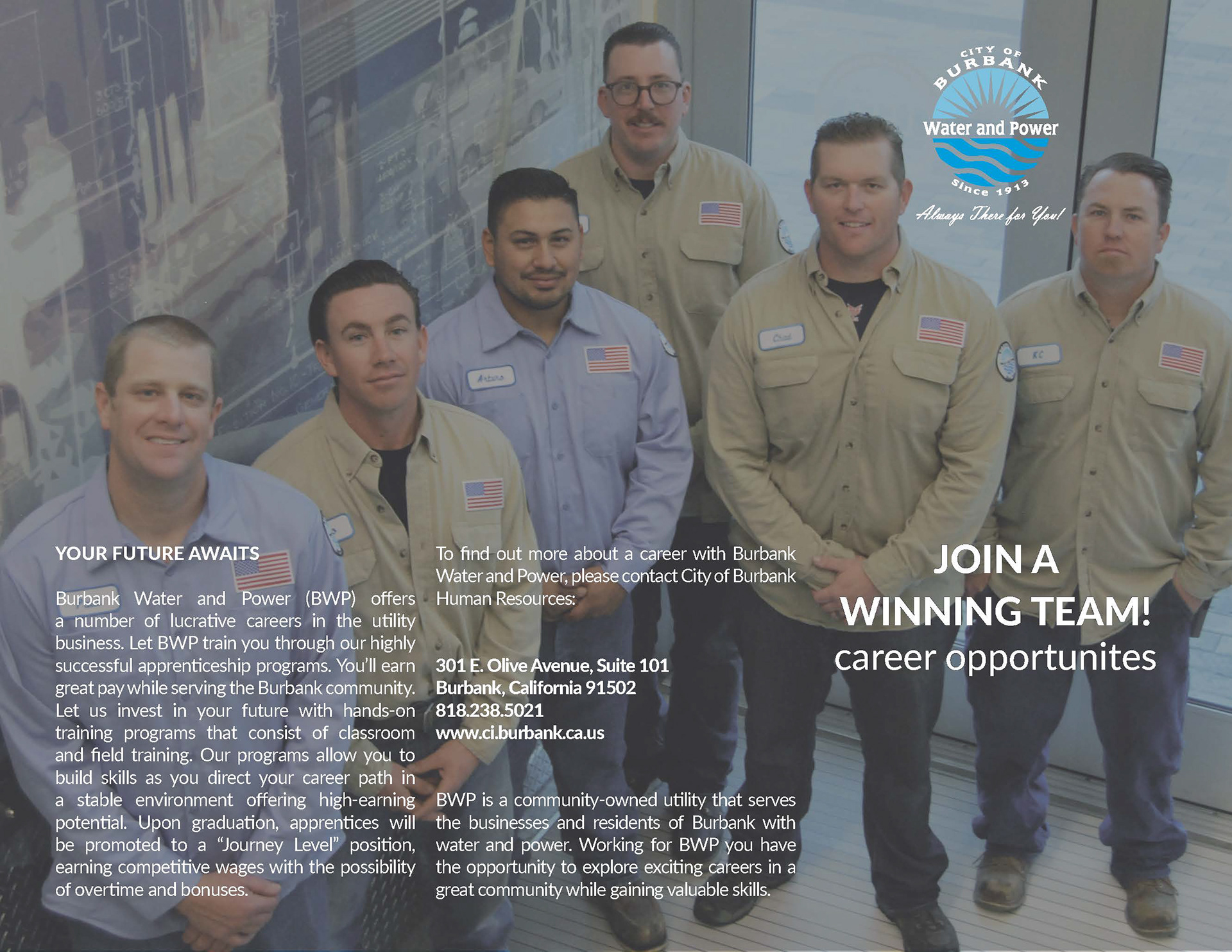
first draft brochure flat recto
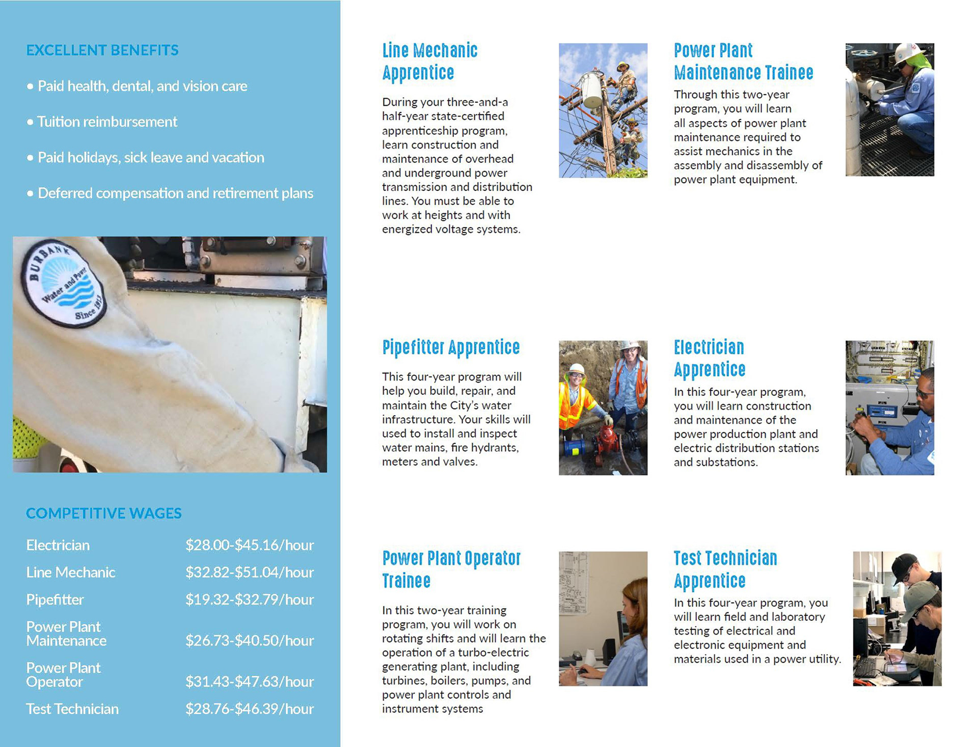
first draft brochure flat verso
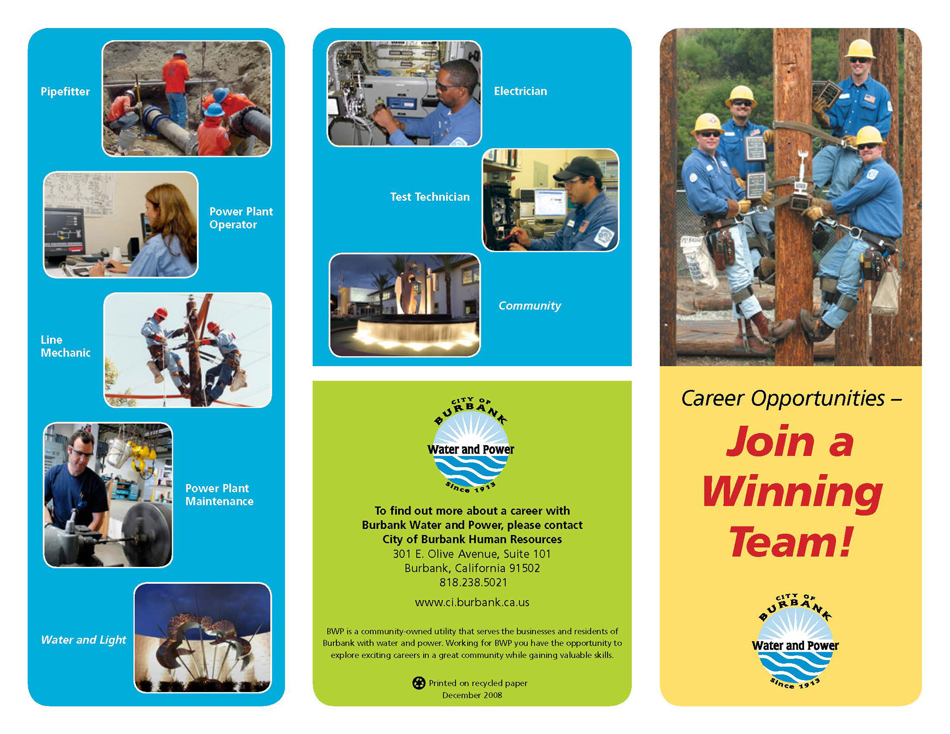
Original brochure recto (made prior to my interning at BWP)
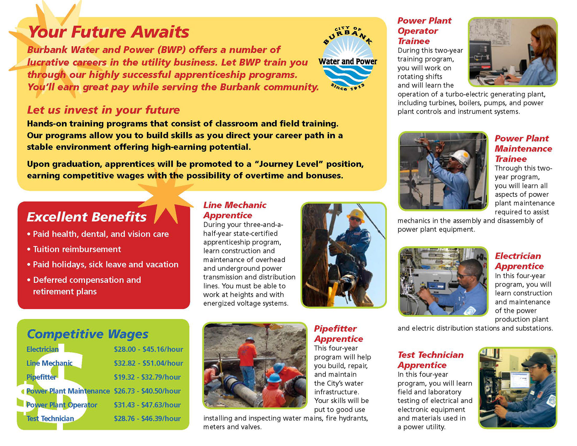
original brochure verso (made prior to my interning at bwp)
The Burbank Water and Power Employment Brochure was assigned to me by the Senior Graphic Designer during recruiting season, when she was "appalled" by the (at the time) current brochure which had been made prior to her own employment at the utility. I created a first draft utilizing photos of some crewmen from the shared network hard-drive. My original thought process was that I wanted the brochure recto to form a single image when laid out completely flat, as well as depict the team spirit and the positive environment that comes with working at BWP. I also straightened up the grid from the original brochure so that the visual would be cleaner and the viewer's eye did not have to wander to find the next element to look at. After revisions with the Senior Graphic designer and our Marketing Department Manager, we opted for what is now the final version of the brochure. I created the cover as a separate entity so that when opened flat, the recto had a black background to bring contrast, therefore more attention to the information in the text. My choice of a single lineman as opposed to the crew is to inspire the viewer, give them a sense of "wow, I want to be that guy!" as he is looking rather heroic performing a quite dangerous task. In addition, I repeated the white text on black background on the left verso flap to truly attract the reader to the benefits and competitive wages, which are supposed to motivate them to further show interest in working at and for the utility.
