
OFFICIAL JCL BLUE LOGO

OFFICIAL JCL ORANGE LOGO

alternate horizontal copper logo

alternate horizontal gold logo

alternate horizontal silver logo

alternate vertical copper logo

alternate vertical gold logo

alternate vertical silver logo
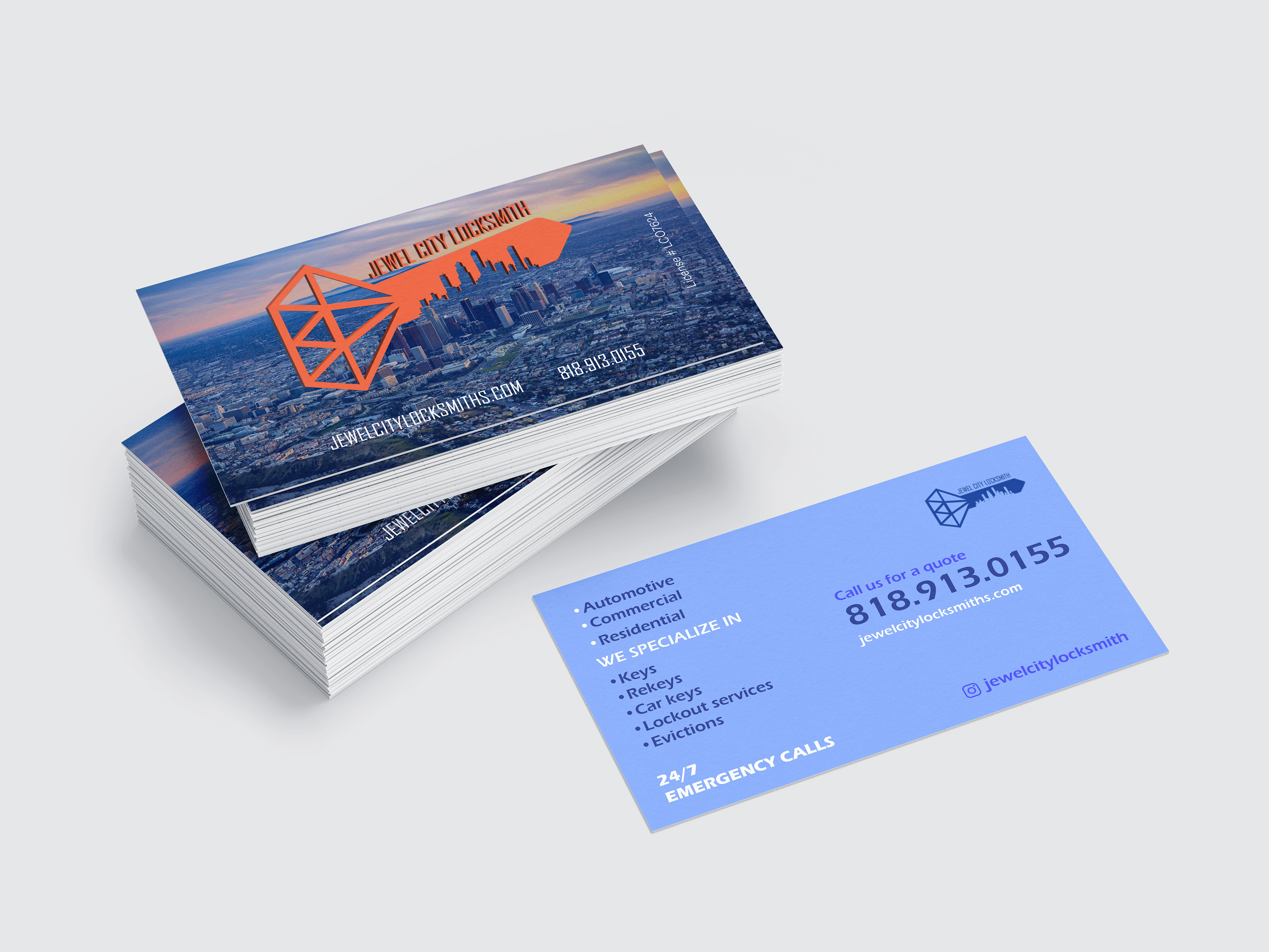
Official jcl business card with photography recto and blue verso

alternate business card white recto orange verso
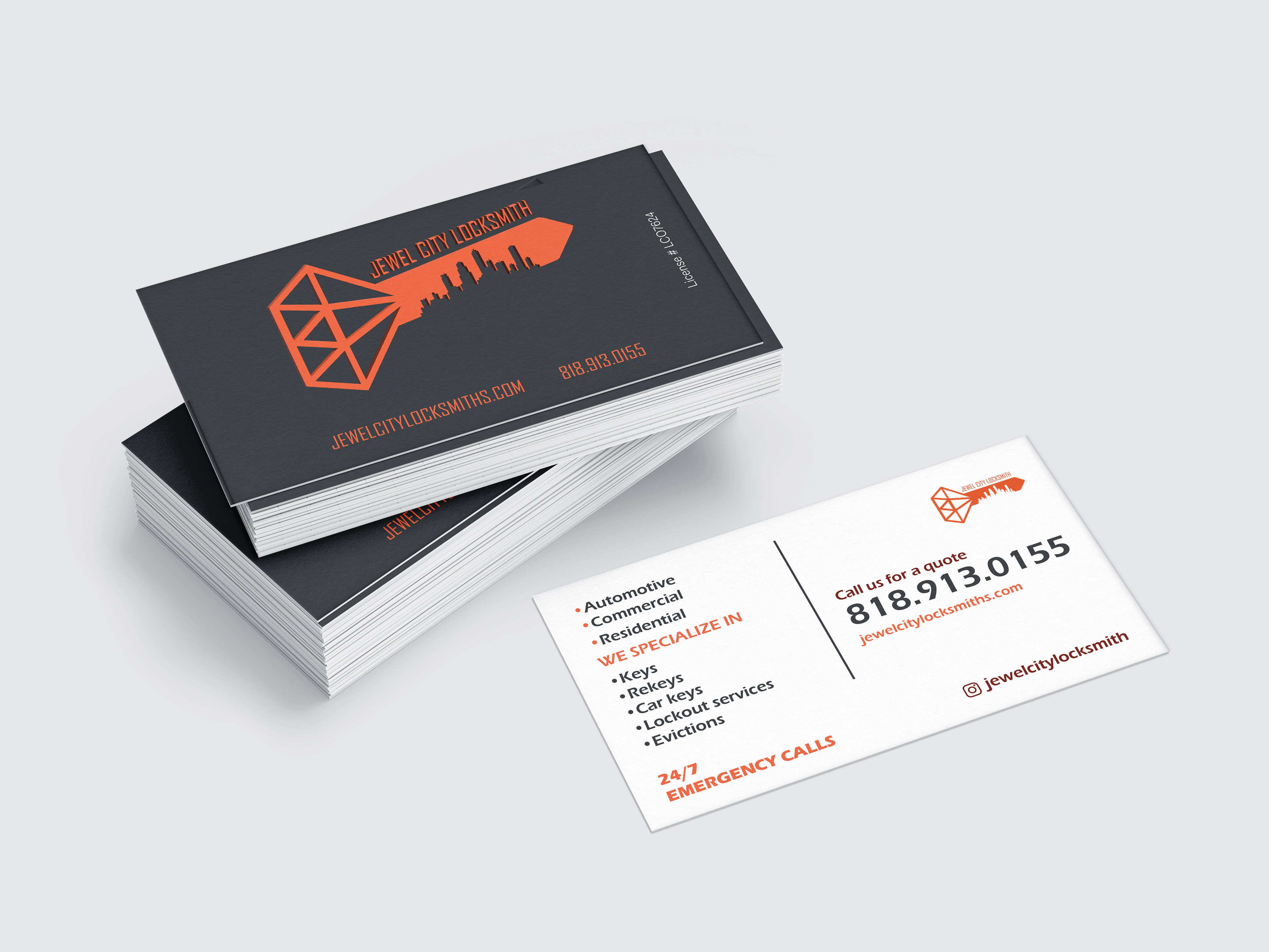
alternate business card gray recto white verso
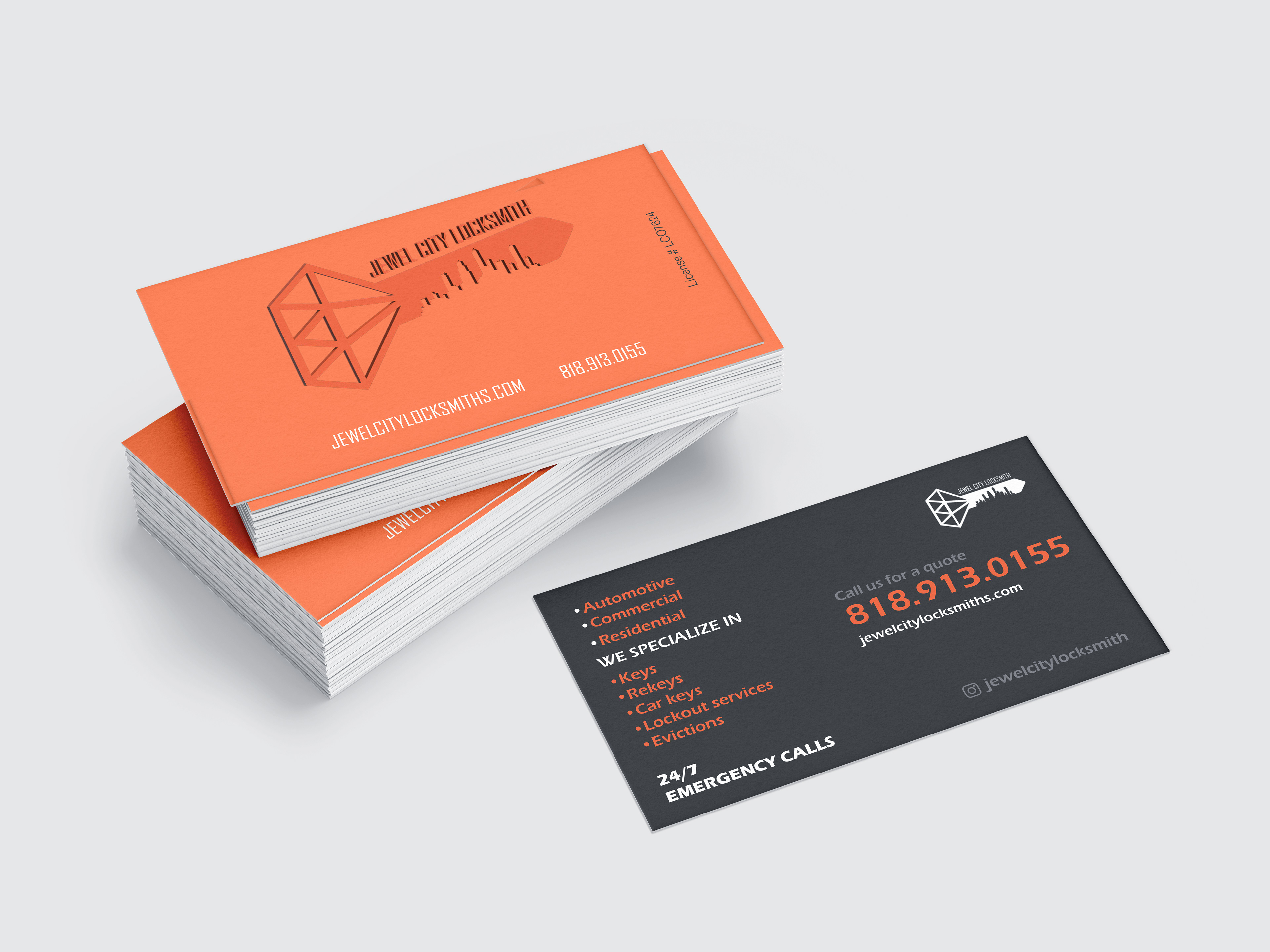
alternate business card orange recto gray verso
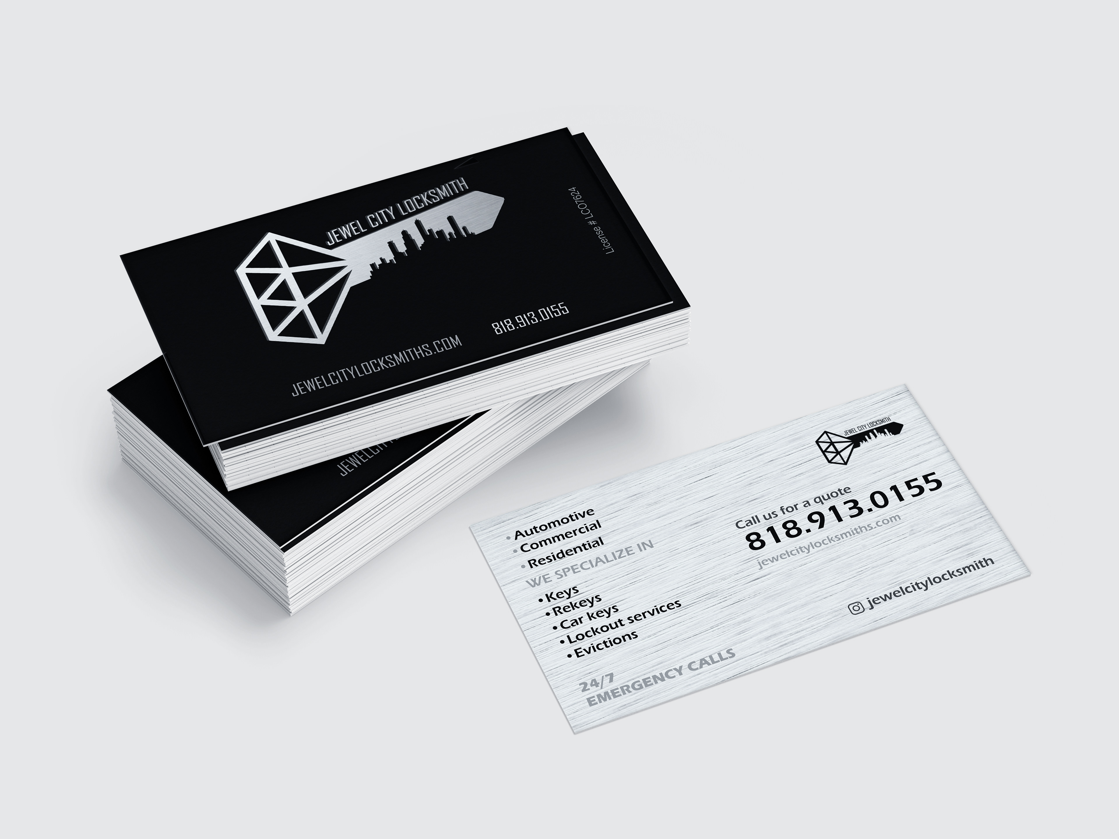
alternate business card black recto silver verso
website optimized for desktop and laptop computers
website optimized for mobile phones

passenger door logo decal

driver-side door logo decal
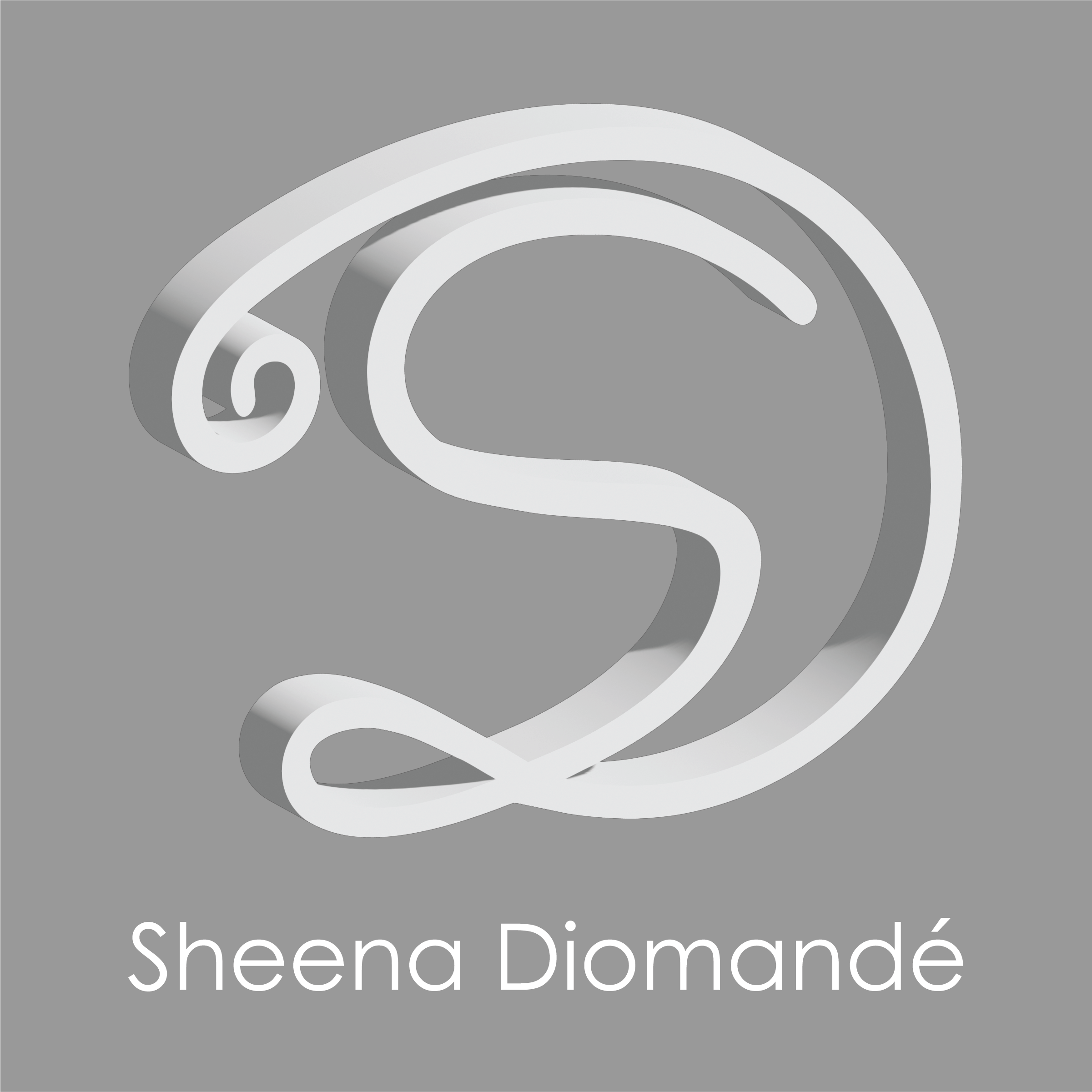
Jewel City Locksmith is a start-up, 24/7, mobile locksmithing company based in Glendale, CA (also known as Jewel City) that offers services over a wide area of Los Angeles County. I was commissioned to design the logo, business cards, and website by the CEO and in collaboration with him as well. The logo was created using Adobe Illustrator, and it is a very direct key, composed of a diamond, a jewel whose shape is reminiscent of the top of a key, and the cut-out of the key is the Los Angeles skyline, to further emphasize the company's origins as well as its mission of servicing a numerous amount of cities. The CEO wanted an option closely related to the L.A. Dodger blue color to represent Los Angeles culture, as well as an option using a warm orange color to represent the typical Los Angeles warm weather. I also played around with alternate options that more closely resembled key colors and textures, such as copper, gold, and silver, as well as different orientations and type treatments. For the business cards, I was able to create a color palette which consisted of white, dark gray, and orange, but ultimately, the business card that the CEO picked utilizes photography of the famous Los Angeles skyline for the recto, along with the orange logo, and the blue logo for the verso as well as a blue/violet color scheme so both versions of the final logo could be displayed. For fun, he did also want me to experiment with creating a business card utilizing the alternate horizontal silver logo, for which I used a black and silver color scheme. For the website, I used Wix to work on desktop and mobile optimization simultaneously, and utilized the white, dark gray, and orange color palette. My favorite aspect of the site is the landing, which plays a time-lapse of the Glendale skyline that further and further backs away to show the city, not only to emphasize the Jewel City aspect of the business, but also the most crucial aspect of it, which is that it offers 24/7 services all over Los Angeles County.