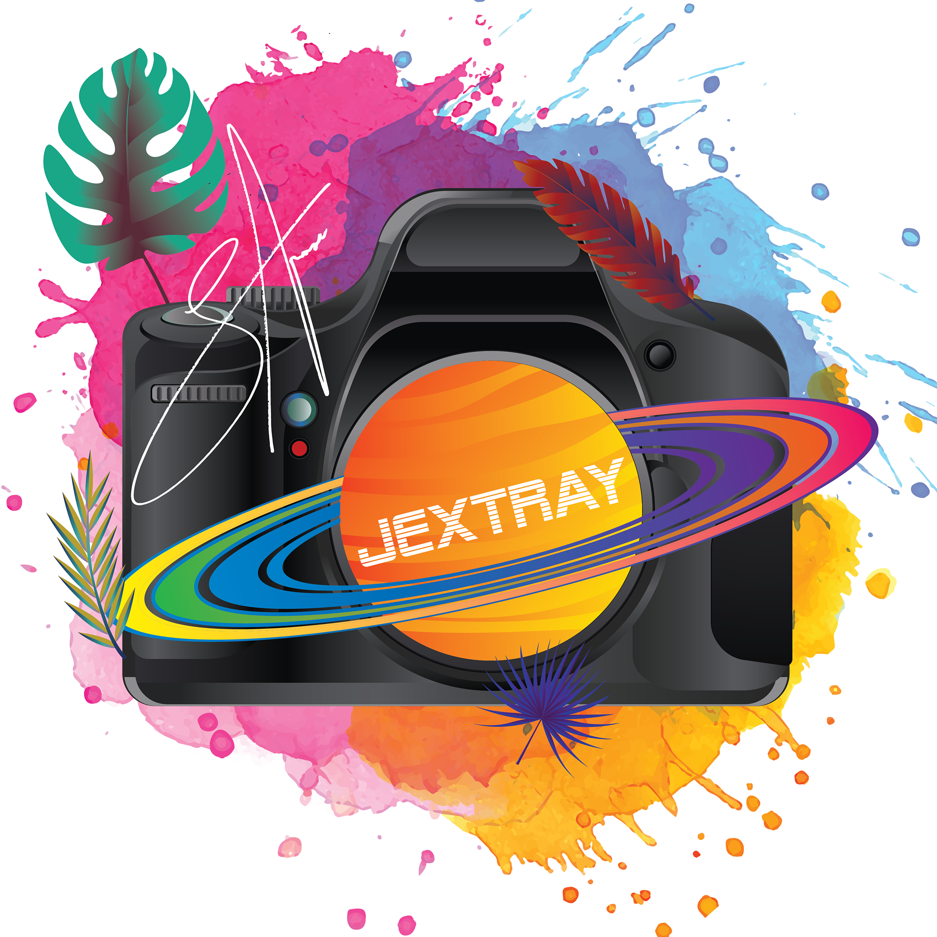
final hoodie design
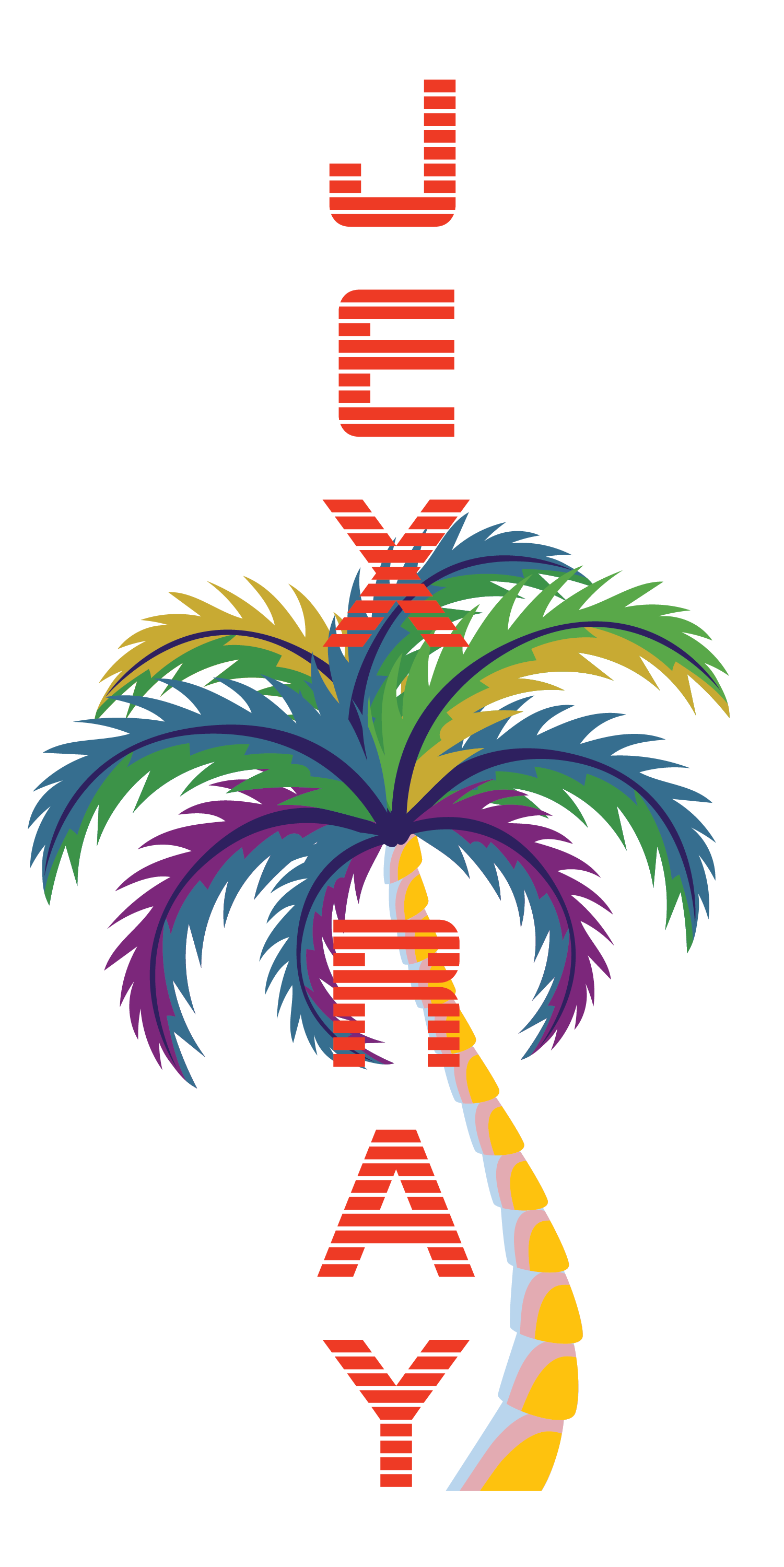
final sweatpants design
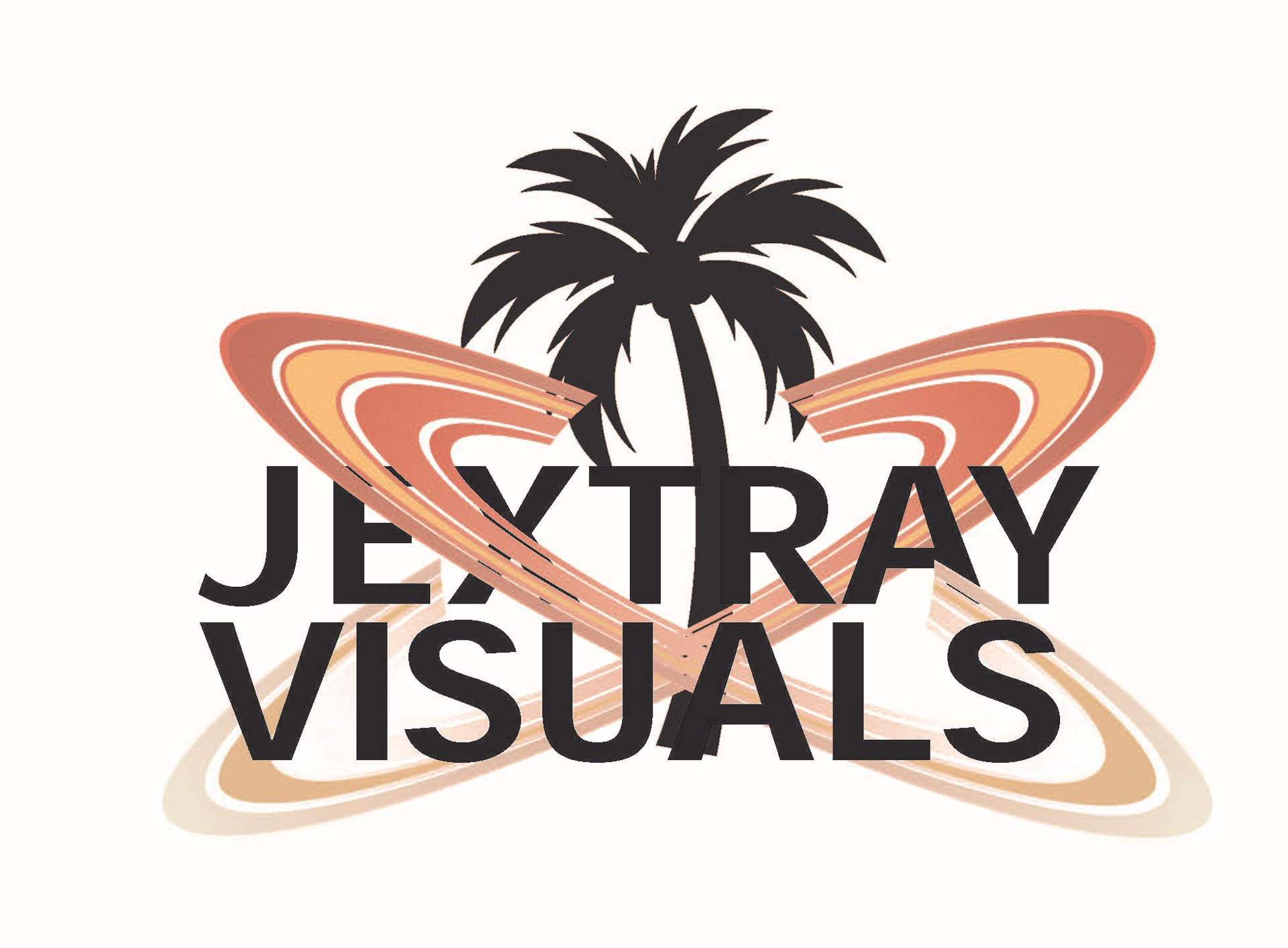
Conceptual jextray hoodie

conceptual jextray sweatpants

Hoodie Rough Sketches 1

Hoodie Rough Sketches 2

Sweatpants rough Sketches 1

Sweatpants rough sketches 2

Initial color palette concept
digital draft
Jextray Fashion is a conceptual and was a potential client design which was unfortunately not retained. I was contacted to create two different graphics, one which would be printed onto a hoodie, and the other one on sweatpants. The client right away mentioned that both designs should follow the same theme whilst being drastically different. He described the style he wanted as 90s Vaporwave mixed in with island vibes, and most importantly to him, the final output should incorporate his passion for photography. I started off with rough pencil sketches to get a more in-depth idea of what my client was really looking for because he had described three very different concepts, and once we discussed and narrowed it down to a few key designs, I proceeded with a color palette. The client mentioned he wanted orange, blue, pink, and green as the most prominent colors, but other colors were obviously welcomed. In addition, he informed me that he envisions the designs printed onto different colored fabrics such as black, grey, brown, beige, and white. This palette served to demonstrate basic color theory concepts to my client so he could understand how the colors would interact with each other, while keeping in mind that colors shown on screen vary from how they come out printed on paper, and even more so when printed on fabric. Once the colors were approved, I did a rough digital draft to show my client a general direction. Through the making of the project, the client decided he wanted to drop the "Visuals" from the text and simply go with "Jextray". In the final hoodie design, I kept the initial Saturn idea and had it work as the camera lens to depict the client's love for photography, and how he wants to expand it to push more boundaries in the future. I kept the island vibes with the palm tree leaves, and ultimately went with watercolor and gradients to blend the colors more seamlessly around the camera. Lastly, the client's signature was added to further individualize what would and could have been his design. In the sweatpants design, I had to drop the camera due to the restriction for space, but kept the island concept by using a full palm tree, which serves as the "T" in "Jextray". The text itself is a burnt orange color which is what the client wanted most as his main color. Ultimately, while my designs were not used for the client's first drop of his clothing line, I am happy with the work that was put into it. The graphics were made using Adobe Illustrator and took a tremendous amount of time, using minimal vector art and most of my own illustrating and digital painting skills. This was also a good experience because it was my first time working with a client of my own and dealing with communication issues, payment issues, and other professional practices.